Layout APIs don’t have to be terrible – lessons from Bokeh
by havoc
Our APIs for arranging elements on the screen are stuck in the stone age. Using these APIs in the simplest way results in an ugly layout. To achieve pretty layouts we deploy tricks that aren’t obvious to newcomers, though many of us have internalized them and don’t notice anymore.
If you ask a designer to arrange items on a page, by default they’re going to line shit up. (They’ll think a lot about exactly which things to align with which other things in order to communicate what’s related to what, and there may be some strategic non-alignment, but … alignment will be happening.)
Layout APIs aren’t designed to implement what graphic designers design.
In the print design tradition, designers don’t have to think about the window size changing or users choosing a larger font. Developers have to translate mockups to code in a way that keeps the design intent while allowing stuff to scale. Alignment of items will often be the most important aspect of the design to preserve.
When we aren’t working with a designer, lining stuff up is a good default anyway. It’ll look better than not. But typical layout APIs require extra work to get stuff aligned.
In this post I’ll talk about:
- how we tried to improve this in the Bokeh project
- three ideas that any UI toolkit could explore to escape the limitations of today’s layout APIs
I suspect there’s a large innovation space here that hasn’t been explored.
Bokeh layout
If you aren’t familiar with Bokeh, it’s a toolkit to create plots and data-centric applications or dashboards. Bokeh lets someone build a web app in plain Python without becoming a web developer. Many data scientists are Python developers but don’t keep up with the modern web stack (JS, HTTP, CSS). Web development is a full-time job in itself, and it’s a distraction.
We faced an issue that typical Bokeh data visualization apps didn’t look nice; after all, they were created by data scientists without design help. How could we make the easy approach a data scientist might choose look nice by default?
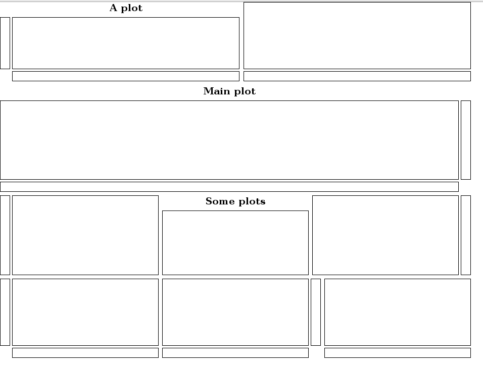
Bokeh users were placing their plots in rows and columns (also known to some as hboxes and vboxes). But if you had two plots in a column, the different label widths on the Y axes would keep the Y axes from aligning with one another, for example. If you stacked two rows into a column, the rows might not be the same total width, and even if each row had the same number of plots, the result wouldn’t be an aligned grid.
We asked designer Sara Schnadt to mock up some prototypical layouts for data visualization apps. She used rows and columns just as data scientists were doing, but she aligned a bunch of the elements.
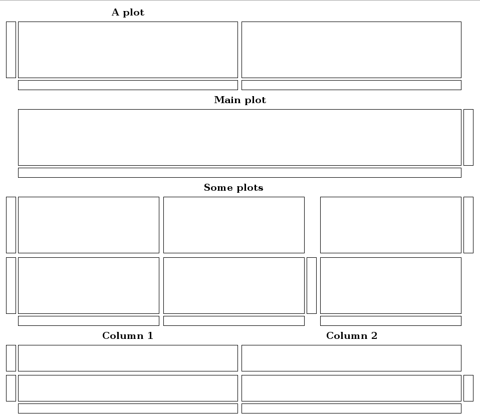
Here’s the goal we arrived at: let the data scientist group plots into rows and columns, and then match widths/heights and align axes as a designer might.
That is, the input should be something like this with no additional hints or manual layout tweaks:
column(row(plot1, plot2), row(plot3, plot4))
Using that input alone, the output has to look good.
Existing solutions used in native toolkits and in CSS were not appropriate:
- boxes and variations on them are simple but the results look bad without a lot of manual massaging;
- grid/table systems require manually choosing the grid size and manually specifying coordinates to attach each element, which is too much work, and making changes later is a pain;
- constraint systems are complicated to understand and horrible to debug;
- fixed sizes and positions aren’t acceptable for most apps.
Here’s what we ended up doing. We converted the rows and columns into a constraint system (using the same Cassowary algorithm that’s made it from scwm to iOS); but for Bokeh, the constraint system is an internal implementation detail, so data scientists shouldn’t end up debugging it. And our constraints are about alignment.
Bryan van de Ven and I created an initial prototype of the algorithm, and Sarah Bird did 95% of the work fixing it and converting the concept into a reality. Bokeh uses Chris Colbert’s implementation of Cassowary for JavaScript.
Our prototype used wireframe dummy widgets. Here’s what happens when you arrange some dummy “plots” with a traditional box layout algorithm:
And here’s what happens when the same dummy widgets (plus I guess a couple more at the bottom) are arranged with the new algorithm:
The code for that prototype can be found here. After a ton of work by Sarah, you can find some real Bokeh code running at http://demo.bokehplots.com, and the source on GitHub.
There’s a lot more that Bokeh could do to be even smarter about layout, but this is a start.
Three ideas to explore further
In the spirit of “yes, and…” I’d love to see other toolkits (and Bokeh) take this further. Here are some ideas I think are useful.
1. Do layout globally, not recursively.
For implementation reasons, toolkits use recursive layout algorithms; each node in the widget tree is responsible for arranging its immediate children.
But often we want to align things that may be in different sub-branches. There are ways to do this, such as hacking in some fixed sizes, or adding hints (one such hint API is GtkSizeGroup). In Bokeh, we use the tree of rows and columns to infer constraints, but we pull everything up into a global toplevel constraint system. With global layout, constraints can span the entire tree.
2. Use constraints as implementation, but try to avoid them in the public API.
Cassowary is a clever algorithm, but not a friendly API in any way. Read these iOS docs; simple, right?
Bokeh takes rows and columns as input. It could probably allow you to provide additional hints, but manually providing constraints gets ugly quickly.
I initially tried to prototype the Bokeh layout algorithm without using a constraint solver; I think it’s possible to do, but the constraint solver approach is much, much simpler. As long as app developers aren’t exposed to debugging constraint systems, it’s a good route to take.
3. Align visual elements, not logical bounds of widgets.
For example:
- even though a plot including its axes might be one widget, we want to consider the axes an element for alignment purposes
- even though a widget such as a slider might have some whitespace around it, we want to consider the visible pixel bounds for alignment purposes
We could think of something like text baseline alignment as a special case of this idea.
Lots more to do
For me, layout remains an unsolved problem. I think it’s because we’re in a rut of old assumptions, such as recursive algorithms that use logical widget bounds without ever “peeking in” to the visual elements inside the widget. We’ve also failed to find the right role for constraint systems; we are trying to use them as the API itself, but in fact they are a powerful implementation technique that could support a lot of different higher-level layout APIs. We could do more to figure out what those APIs could be.
Historically, layout APIs have been implementation-driven; they didn’t start by thinking about “what graphic designers design,” or “what app developers would like to maintain,” they started with something like “how GUI toolkits work.” Rethinking these APIs in a more top-down, experience-oriented way could find quite a bit of room for improvement.
Constraint systems are nice for common stuff, but they have nasty edge cases – either none or more than one solution.
I think your approach of combining a limited API/solution-space with a constraint system is a nice tradeoff, we get the nice behaviour whilst avoiding the pitfalls.
If you are interested in exploring this space more, google for the various Java LayoutManager libraries lying around, there are a ton of them exploring various possibilities in this space. (Probably because Java has one of the easiest API’s to plug-in new layout systems)
I still use JGoodies FormLayout, but there are better libraries out there now.
May we can start with GtkGrid. It is already a row by column widget, way adding API to it, or fork a new one to avoid expose actual API, can help as an start point.
There are GtkFlow too as dynamic arrangement container then we can make them cooperate with a top level manager container, to alter its child containers (may both GtkFlow and/or GtkGrid) to get job done.
Grid isn’t meant for this use case.
But GtkSizeGroup already exists for precisely the purpose of forcing alignment (via size) among widgets that might be located in different containers (grids, boxes, etc.)
When I said “To achieve pretty layouts we deploy tricks that aren’t obvious to newcomers, though many of us have internalized them and don’t notice anymore” I meant things like GtkSizeGroup. Setting up boxes the right way and using size group can certainly get things aligned (at least for widgets whose visual bounds match their allocation). But it doesn’t feel like the API is taking the shortest or most comprehensible path to a nice result.
Existing layout APIs can be made to work, but it’s a clunky process.
Any chance you could share those mockups of prototypical layouts for data visualization apps?
I wanted to, spent some time trying to find them and couldn’t. 🙁
Emmanuele Bassi is busy bringing the Cassowary algorithm to GTK: https://github.com/ebassi/emeus