The dangerous “UI team”
by havoc
Background: customers hire products to do a job
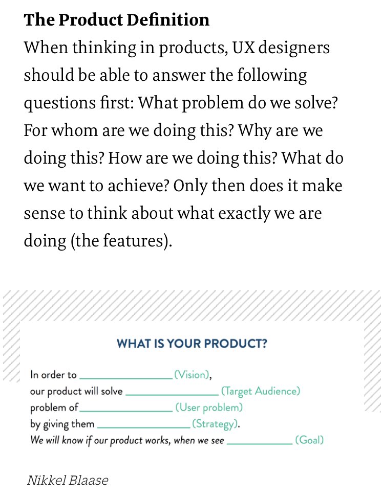
I enjoyed Nikkel Blaase’s recent discussion of product design. In this article he puts it this way:
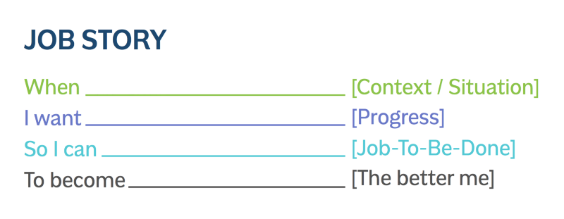
In another article he puts it this way:
This isn’t a new insight, but it’s still important, and well-stated here in these graphics. The product has to work and it can only work if you know what it’s supposed to do, and who it’s supposed to do it for.
“Interact with a UI” is not a job
Customers do not want to click on UI controls. Nor do they want to browse a web site, or “log in,” or “manage” anything, or for that matter interact with your product in any way. Those aren’t goals people have when they wake up in the morning. They’re more like tedious tasks they discover later.
So why does your company have a “UI team”? You’ve chartered a team with the mission people need to click on stuff, let’s give them some clicky pixels.
The “UI team” has “UI” right there in the name (sounds user-friendly doesn’t it?). But this is a bottom-up, implementation-driven way to define a team. You’ve defined the team by solution rather than by problem.
Instead, define your teams by asking them to solve real customer problems in the best way they can come up with. Product design doesn’t mean “come up with some pixels,” it means “solve the problem.”
The best UX will often be no UI at all: if the customer gets your product and their problem goes away instantly with no further steps, that’s amazing. Failing that, less UI beats more UI; and for many customers and problems, a traditional GUI won’t be right. Alternatives: command line, voice recognition, gestures, remote control, documentation, custom hardware, training, …
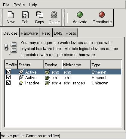
When we were inexperienced and clueless at Red Hat back in the day (1999 or so), we started stamping GUIs on all the things — because “hard to use” was a frequent (and true) criticism of Linux, and we’d heard that a GUI would solve that. Our naïveté resulted in stuff like this (this is a later, improved version, slightly more recent than the 1999-era):

We took whatever was in the config file or command line tools and translated it into GTK+ widgets. This may be mildly useful (because it’s more discoverable than the command line), but it’s still a learning curve… plus this UI was a ton of work to implement!
In the modern Linux community, people have a little more clue about UX. There’s still a (nicer) screen like this buried somewhere. However, I never use it. The main UX is that if you plug in a network cable, the computer connects to the network. There’s no need to open a window or click any widgets at all.
Most of the work to implement “the computer connects automatically” was behind the scenes; it was backend work, not UI work.
At Red Hat, we should have gone straight for some important problem that real people had, such as “how do I get this computer on the network?”, and solved that. Eventually we did, but only after wasting time.
Don’t start with the mission “make a UI for <insert hard-to-use thing here>.” Nobody wants to click your widgets.
Define teams by the problem they’ll be solving. Put some people on the team that know how to wrangle the backend. Put some people on the team that know HTML or UI toolkit APIs. Put a designer on the team. Maybe some QA and a copywriter. Give the team all the skills they need, but ask them to solve an articulated customer problem.
Another way to put it: a team full of hammers will go around looking for nails. A team that’s a whole toolbox might figure out what really needs doing.
P.S. a related wrong belief: that you can “build the backend first” then “put a UI on it” later.


Behaviour driven development?
[…] The dangerous UI team: http://blog.ometer.com/2016/01/26/the-dangerous-ui-team/ […]
[…] Source: The dangerous “UI team” […]
[…] The Dangerous “UI Team” – Havoc Pennington […]