Havoc's Blog

this blog contains blog posts

Build a workbench in 2 years

(This post has nothing to do with software, move along if you aren’t into woodworking…)

Here’s my somewhat different workbench design (based on Christopher Schwarz’s “Knockdown Nicholson” plans which became this article), thinking someone out there might be interested. Also it’s a lesson in how to make simple plans ten times more complicated — whether you’d like to avoid or imitate my example, I’ll leave to you.

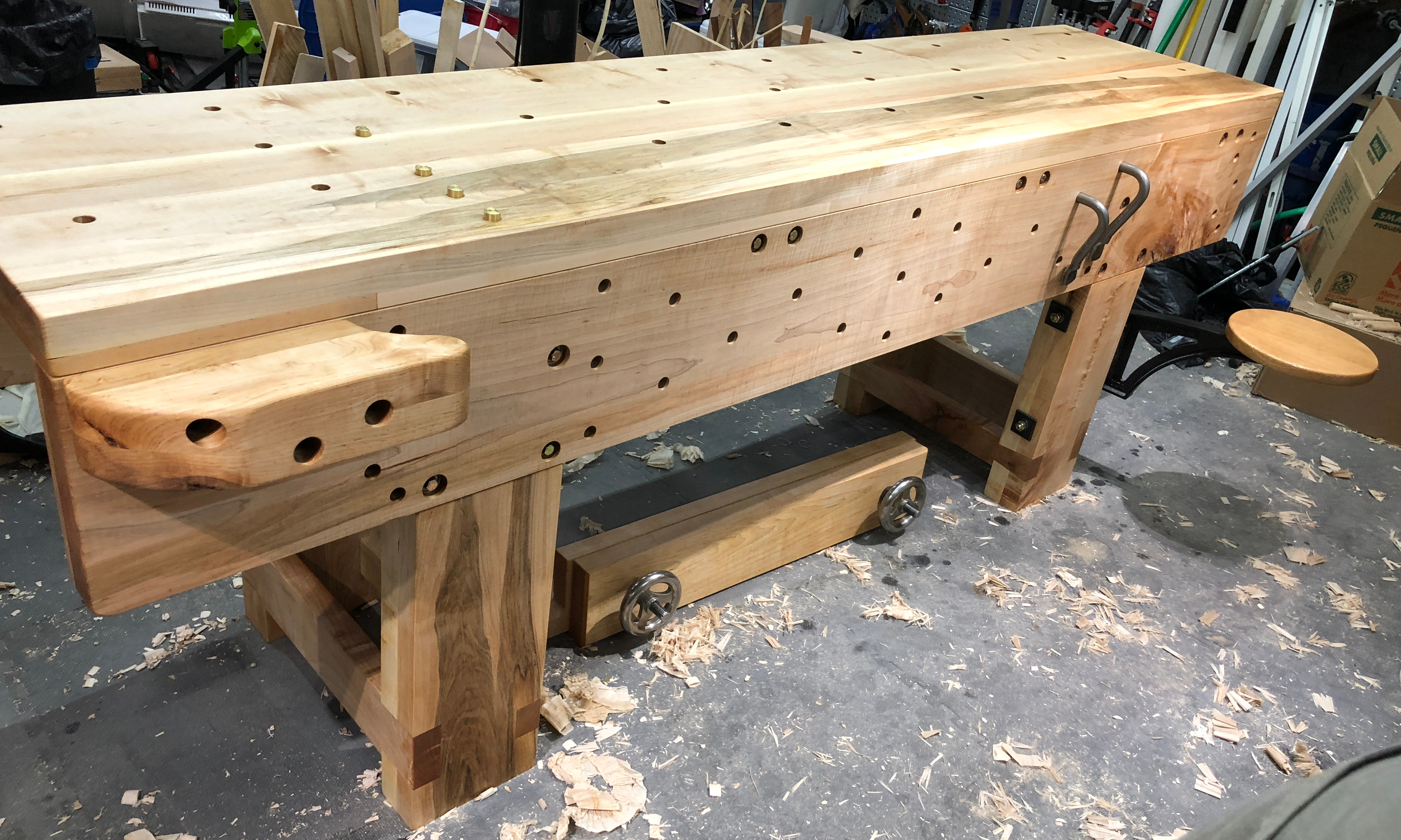
Here’s my finished workbench. (Someone actually skilled could build something prettier! But I think my bench will work well for decades if I’m fortunate.)

And here’s a tweet with the pile of wood I started with two and a half years ago:

The Popular Woodworking article suggests “With $100 in lumber and two days, you can build this sturdy stowaway bench” to which I say, hold my beer. I can spend a lot more, and take way more time!

I have many excuses: my bench project is 2.5 years old, and my daughter is just over 2 years old. I started a new job and then left that to start a company. I probably had a few hours of shop time on average per week, and I worked on a lot of shop projects that weren’t the workbench itself.

Excuses only account for the calendar time though, not the shop time. This was closer to a 200-hour project for me than a two-day project.

How do you make a workbench project take ten times longer? (Other than “be an inexperienced hobbyist woodworker”?)

1. Use hardwood rather than southern yellow pine

I bought a pile of soft maple thinking it’d be a mostly-cosmetic choice. I’m very glad the finished bench is maple, but it slowed me down in several ways:

  • the maple is heavy and the bench parts are hard to move with only one person, leading to several times where I had to wait for help to come over
  • I had to mill all the boards from rough-sawn
  • I decided maple meant more worry about wood movement, leading to design complexity

When I started this, I’d just finished a couple of sawbenches and some bookshelves made of pine, and I was sick of the stuff; it’s horrible. (Bias I will admit to: I have childhood memories of walking through stands of loblolly pine trees in 95-degree Georgia heat, getting ticks and sweating; loblolly pine offers no shade to speak of. Loblolly “forests” are the worst.)

2. Make it 8 feet long

Unfortunately, both jointer planes and powered jointers are designed for up to 6′ boards. 8′ boards not only have more surface area, they are also too long for the jointers. 8′ seems like it should be 33% more work than 6′, but it isn’t linear like that because the required skill level goes up.

I started this project to solve a too-short-bench problem. My old bench is based on these Ana White plans. I fixed that one up to be coplanar on the front, added a vise, and added a bunch of weight; it’s hideous but it does permit handwork with my modifications… as long as your boards are no longer than about 2.5 feet. The first time I tried to make a project with longer boards, I discovered I’d need a new bench.

My bench isn’t only longer than the original plans; everything is larger-scale. Most of the 8/4 lumber came out about 1-3/4″ rather than 1-1/2″ like construction lumber. The legs are 8″ wide rather than 5-1/2″ wide, and the top is 2-1/4″ thick all the way to the edge.

3. No power saws

I started to do this entirely with hand tools; after a while I caved and got a nice jointer/planer machine.  Milling these boards completely by hand was beyond my hobbyist pay grade.  That said, every part of the bench still required significant hand-planing, and I didn’t use power saws or routers. I’d guess I spent hours just cleaning up ends with a shooting board.

If I built this bench again, I’d probably get a track saw, which would save a little sawing time and a LOT of cleanup-planing time.

4. Attach the top to the aprons rather than the leg assemblies

After I started the project, I realized that the original Knockdown Nicholson design doesn’t allow for much wood movement. Southern yellow pine doesn’t move too much, and I was worried maple would cause a problem. Maybe it would have, maybe not, I don’t know.

Rather than bolt the top to the leg assemblies, I used dowel nuts (the large 3/8-16 Veritas knockdown variety) to bolt “joists” between the aprons, and then lag-screwed the top to those joists.

There are advantages to the way I did it:

  • No counterbores on top to be ugly and fill with shavings
  • If the aprons move seasonally, the top should stay flat rather than being pushed up on the edges
  • The top is ultra-solid: 2-1/4 inches thick, then also held flat and supported by the four joists and the aprons
  • The joists are exactly the same length as the leg assemblies are wide, so they help hold the aprons flat

There are also disadvantages:

  • Lots of extra time: making the joists, drilling the two intersecting holes for the knockdown fasteners, making the notches in the aprons for the joists
  • Knockdown and assembly are harder (I intend to do this only when moving to a new house, so it’s OK, but it’d be an issue in a bench meant to regularly go places)

5. Build the leg assemblies with giant dovetails

Giant dovetails turn out to be much more time-consuming than regular dovetails. I started on this path because I didn’t have enough lumber to make the large screwed-on “plate” in the original plans.

I sawed most of the tails at least a little bit off square; squaring them up wasn’t easy at all, since they were wider than any chisel I owned. Similarly, the sockets were deeper than any router plane I had would go, with sides and bottom too large for my chisels. If you have timber-framing tools you might be able to do this more quickly than I did. This was another consequence of using the rough-sawn maple rather than construction lumber. Tools tend to top out at 1-1/2″ widths and depths, while the maple was more like 1-3/4″.

6. Overkill the tolerances

With more skill, I’d have known how to cut more corners. Instead, I made things as perfect as I could make them.  This was still far from perfect — I could point out flaws in the workbench for hours!

To build a bench really quickly I think you’d want to avoid milling or planing construction lumber at all. But gosh it’d have some huge gaps. (My old Ana-White-style workbench is like this, because I owned neither plane nor planer… I pulled everything square with clamps, then Kreg-screwed it in place.)

7. Build a workbench without a workbench

While building a workbench, I often thought “this sure would be easier if I had a workbench.”

Planing boards on sawbenches sucks. Hello back pain! My old workbench is only 3′ wide, so it wasn’t an option (that’s why I built the new bench in the first place). It’d almost be worth building a terrible-but-full-size Kreg-screwed temporary bench, purely to build the final bench on, and then burning the temporary bench. Or perhaps some sort of bench-height sawhorses-and-plywood contraption.

What went well

The bench works very well — everything that made it take more time, had at least some payoff. I’m glad I have an 8′ maple bench instead of a 6′ pine bench. I’m glad it’s as good as I knew how to make it. The obnoxious-to-build joists made the top prettier and flatter, and the giant dovetails made the leg assemblies rock solid.

It breaks down into 5 parts, just like Christopher Schwarz’s original, and the McMaster-Carr mounting plates work great.

I love the Benchcrafted swing-away seat, it gives me somewhere to sit down that takes up zero floor space when not in use. (Of course I overkilled attaching it, with a bolt all the way through the bench leg, and thick square washers.)

Lessons learned

Ordering a workbench from Plate 11 or Lie-Nielsen makes total sense and their prices are a bargain!

If you do build something, consider sticking to the simple plan.

And I’m now a whole lot better at planing, sawing, drilling, sharpening, and all sorts of other skills than I was when I started. The next project I make might go a little bit faster.


Dear package managers: dependency resolution results should be in version control

If your build depends on a non-exact dependency version (like “somelibrary >= 3.1”), and the exact version gets recomputed every time you run the build, your project is broken.

  • You can no longer build old versions and get the same results.
  • Want to cut a bugfixes-only release from an old branch? Sorry.
  • Want to use git bisect? Nope.
  • You can’t rely on your code working because it will change by itself. Maybe it worked today, but that doesn’t mean it will work tomorrow. Maybe it worked in continuous integration, but that doesn’t mean it will work when deployed.
  • Wondering whether any dependency versions changed and when? No way to figure it out.

Package management and build tools should get this right by default. It is a real problem; I’ve seen it bite projects I’m working on countless times.

(I know that some package managers get it right, and good for them! But many don’t. Not naming names here because it’s beside the point.)

What’s the solution? I’d argue that it’s been well-known for a while. Persist the output of the dependency resolution process and keep it in version control.

  • Start with the “logical” description of the dependencies as hand-specified by the developers (leaf nodes only, with version ranges or minimum versions).
  • Have a manual update command to run the dependency resolution algorithm, arriving at an exhaustive list of all packages (ideally: identified by content hash and including results for all possible platforms). Write this to a file with deterministic sort order, and encourage keeping this file in git. This is sometimes called a “lock file.”
  • Both CI and production deployment should use the lock file to download and install an exact set of packages, ideally bit-for-bit content-hash-verified.
  • When you want to update dependencies, run the update command manually and submit a pull request with the new lock file, so CI can check that the update is safe. There will be a commit in git history showing exactly what was upgraded and when.

Bonus: downloading a bunch of fixed package versions can be extremely efficient; there’s no need to download package A in order to find its transitive dependencies and decide package B is needed, instead you can have a list of exact URLs and download them all in parallel.

You may say this is obvious, but several major ecosystems do not do this by default, so I’m not convinced it’s obvious.

Reproducible builds are (very) useful, and when package managers can’t snapshot the output of dependency resolution, they break reproducible builds in a way that matters quite a bit in practice.

(Note: of course this post is about the kind of package manager or build tool that manages packages for a single build, not the kind that installs packages globally for an OS.)

Layout APIs don’t have to be terrible – lessons from Bokeh

Our APIs for arranging elements on the screen are stuck in the stone age. Using these APIs in the simplest way results in an ugly layout. To achieve pretty layouts we deploy tricks that aren’t obvious to newcomers, though many of us have internalized them and don’t notice anymore.

If you ask a designer to arrange items on a page, by default they’re going to line shit up. (They’ll think a lot about exactly which things to align with which other things in order to communicate what’s related to what, and there may be some strategic non-alignment, but … alignment will be happening.)

Layout APIs aren’t designed to implement what graphic designers design.

In the print design tradition, designers don’t have to think about the window size changing or users choosing a larger font. Developers have to translate mockups to code in a way that keeps the design intent while allowing stuff to scale. Alignment of items will often be the most important aspect of the design to preserve.

When we aren’t working with a designer, lining stuff up is a good default anyway. It’ll look better than not. But typical layout APIs require extra work to get stuff aligned.

In this post I’ll talk about:

  • how we tried to improve this in the Bokeh project
  • three ideas that any UI toolkit could explore to escape the limitations of today’s layout APIs

I suspect there’s a large innovation space here that hasn’t been explored.

Bokeh layout

If you aren’t familiar with Bokeh, it’s a toolkit to create plots and data-centric applications or dashboards. Bokeh lets someone build a web app in plain Python without becoming a web developer. Many data scientists are Python developers but don’t keep up with the modern web stack (JS, HTTP, CSS). Web development is a full-time job in itself, and it’s a distraction.

We faced an issue that typical Bokeh data visualization apps didn’t look nice; after all, they were created by data scientists without design help. How could we make the easy approach a data scientist might choose look nice by default?

Bokeh users were placing their plots in rows and columns (also known to some as hboxes and vboxes). But if you had two plots in a column, the different label widths on the Y axes would keep the Y axes from aligning with one another, for example. If you stacked two rows into a column, the rows might not be the same total width, and even if each row had the same number of plots, the result wouldn’t be an aligned grid.

We asked designer Sara Schnadt to mock up some prototypical layouts for data visualization apps. She used rows and columns just as data scientists were doing, but she aligned a bunch of the elements.

Here’s the goal we arrived at: let the data scientist group plots into rows and columns, and then match widths/heights and align axes as a designer might.

That is, the input should be something like this with no additional hints or manual layout tweaks:

column(row(plot1, plot2), row(plot3, plot4))

Using that input alone, the output has to look good.

Existing solutions used in native toolkits and in CSS were not appropriate:

  • boxes and variations on them are simple but the results look bad without a lot of manual massaging;
  • grid/table systems require manually choosing the grid size and manually specifying coordinates to attach each element, which is too much work, and making changes later is a pain;
  • constraint systems are complicated to understand and horrible to debug;
  • fixed sizes and positions aren’t acceptable for most apps.

Here’s what we ended up doing. We converted the rows and columns into a constraint system (using the same Cassowary algorithm that’s made it from scwm to iOS); but for Bokeh, the constraint system is an internal implementation detail, so data scientists shouldn’t end up debugging it. And our constraints are about alignment.

Bryan van de Ven and I created an initial prototype of the algorithm, and Sarah Bird did 95% of the work fixing it and converting the concept into a reality. Bokeh uses Chris Colbert’s implementation of Cassowary for JavaScript.

Our prototype used wireframe dummy widgets. Here’s what happens when you arrange some dummy “plots” with a traditional box layout algorithm:

before

And here’s what happens when the same dummy widgets (plus I guess a couple more at the bottom) are arranged with the new algorithm:

after

The code for that prototype can be found here. After a ton of work by Sarah, you can find some real Bokeh code running at http://demo.bokehplots.com, and the source on GitHub.

There’s a lot more that Bokeh could do to be even smarter about layout, but this is a start.

Three ideas to explore further

In the spirit of “yes, and…” I’d love to see other toolkits (and Bokeh) take this further. Here are some ideas I think are useful.

1. Do layout globally, not recursively.

For implementation reasons, toolkits use recursive layout algorithms; each node in the widget tree is responsible for arranging its immediate children.

But often we want to align things that may be in different sub-branches. There are ways to do this, such as hacking in some fixed sizes, or adding hints (one such hint API is GtkSizeGroup). In Bokeh, we use the tree of rows and columns to infer constraints, but we pull everything up into a global toplevel constraint system. With global layout, constraints can span the entire tree.

2. Use constraints as implementation, but try to avoid them in the public API.

Cassowary is a clever algorithm, but not a friendly API in any way. Read these iOS docs; simple, right?

Bokeh takes rows and columns as input. It could probably allow you to provide additional hints, but manually providing constraints gets ugly quickly.

I initially tried to prototype the Bokeh layout algorithm without using a constraint solver; I think it’s possible to do, but the constraint solver approach is much, much simpler. As long as app developers aren’t exposed to debugging constraint systems, it’s a good route to take.

3. Align visual elements, not logical bounds of widgets.

For example:

  • even though a plot including its axes might be one widget, we want to consider the axes an element for alignment purposes
  • even though a widget such as a slider might have some whitespace around it, we want to consider the visible pixel bounds for alignment purposes

We could think of something like text baseline alignment as a special case of this idea.

Lots more to do

For me, layout remains an unsolved problem. I think it’s because we’re in a rut of old assumptions, such as recursive algorithms that use logical widget bounds without ever “peeking in” to the visual elements inside the widget. We’ve also failed to find the right role for constraint systems; we are trying to use them as the API itself, but in fact they are a powerful implementation technique that could support a lot of different higher-level layout APIs. We could do more to figure out what those APIs could be.

Historically, layout APIs have been implementation-driven; they didn’t start by thinking about “what graphic designers design,” or “what app developers would like to maintain,” they started with something like “how GUI toolkits work.” Rethinking these APIs in a more top-down, experience-oriented way could find quite a bit of room for improvement.


Professional corner-cutting

Steve Jobs famously cared about the unseen backs of cabinets. Antique furniture built with hand tools isn’t like that at all. Cabinetmakers made each part to the tolerance that mattered. The invisible parts were left rough, with plane and saw marks, to save time. The visible parts, however, were cleaned up and polished. Some surfaces were made precisely straight and square, for structural reasons; while nonstructural surfaces were only straight enough to look good to the eye.

Think about an apprentice in an old cabinet shop. An apprentice painstakingly smoothing an invisible surface would be yelled at for wasting time. An apprentice failing to smooth a visible surface would be yelled at for producing crappy work. To become a professional, the apprentice learned to work efficiently but still do a good job. Crucially, a “good job” was defined in terms of customer concerns. [1]

Cabinetmakers were focused on what their customers cared about. Customers wanted the furniture to look good, and they wanted it to be structurally sound. They didn’t care about invisible tool marks, and didn’t want to pay extra to have those removed.

Software remains a craft rather than a science, relying on the experience of the craftsperson. Like cabinetmakers, we proceed one step at a time, making judgments about what’s important and what isn’t at each step.

A professional developer does thorough work when it matters, and cuts irrelevant corners that aren’t worth wasting time on. Extremely productive developers don’t have supernatural coding skills; their secret is to write only the code that matters.

How can we do a better job cutting corners? I think we can learn a lot from people building tables and dressers.

1. Own the implementation decisions

It is irresponsible to ask the customer (or manager, or other not-doing-the-work stakeholder) to tell you how to make technical tradeoffs. Cabinetmakers didn’t ask their customers how flat a tenon had to be and this is not the customer’s problem. The customer wants us to do it properly but not wastefully. It is our decision how to go about this, and if we get it wrong it’s our fault.

On software teams, there’s often a developer trying to push these decisions up to management or onto the customer, because they don’t want to “get in trouble” later. Perhaps they complain to management about “technical debt” and being “given time to work on it.” This is a sign that we aren’t owning our decisions. If the technical debt is a problem, 1) we shouldn’t have put it in there, and 2) we should include it in our estimates and address it. A cabinetmaker would not ask the customer to put “make tenons straight” on the sprint. Nobody cares. Technical debt is our problem; that’s the job.

If you don’t own your technical decisions, you can never get them right, because nobody else knows how to make them. Insist on making them. And yes, that means getting them wrong is your fault. It may mean giving people bad news about how long things will take. It may mean you get yelled at sometimes.

2. Understand the customer’s needs and preferences

Because we must make tradeoffs and not push choices onto the customer, we have to understand what matters and what doesn’t. It’s easier to establish this in the world of furniture (“doesn’t break when you sit on it,” “looks nice”). In software, we have to know what job our software will do for the customer.

This is where we should be getting customer input (though watching what they do may be more valuable than asking them what they think), and reaching a consensus with our management team or client.

We should not ask customers for more precision than they can give us (a symptom of this is to badger customers or managers for detailed “requirements,” then complain endlessly about “changing requirements”). Our job involves converting vague needs into concrete software — if we’re lucky, we have the help of a skilled product designer, or guidance from a management team that’s able to be somewhat precise, but if not we have to do it ourselves. Accept the job and learn to do it.

It’s unprofessional to be the kind of developer who doesn’t care about user experience, doesn’t care about business context, or “just wants to be told the requirements.” It’s impossible to work efficiently or to do a good job without understanding the context.

A professional developer can take a desired UX and work out the technical steps to get there as efficiently as possible. And they do get there; they don’t build something odd that doesn’t meet the need, or something slapdash that doesn’t work.

3. Don’t be lazy

Corner-cutting should be a deliberate decision; “this truly doesn’t matter.” It should not be because it’s 5pm and we’re going home. When we find ourselves asking “do I really have to redo this…” then we need to redo it.

Cutting corners should feel like you have a clear focus and you’re skipping tasks that don’t matter for that focus. Cutting corners should not feel like you’re doing poor-quality work.

To push back on an unrealistic schedule, work to narrow the scope or weaken the requirements.

Let’s say you’re making some kitchen cabinets. You could make them all with hand tools, no metal connectors and no plywood. They would be gorgeous and cost about $150,000. When the customer says that’s too much time and too expensive, you could make them the usual modern way with machines, screws and plywood; which is a sound approach, though a little uglier. This is like offering to build a web app that’s not quite as slick and beautiful — something a little more off-the-shelf.

That’s all fine. What’s not fine: delivering either of those choices unfinished and broken. “Oh, I forgot the cabinet doors.” “Sorry these things aren’t painted!”

To cut scope, we should do something defined (such as leave out a feature or refinement), rather than something undefined (like skipping testing).

Professionals are doing it for others

All of this sounds hard, and it is. As in Amy Hoy’s description of these students learning a craft, at first we may fight it and focus on our own needs and emotions.

Professional software developers are performing a service for others. That’s the difference between a professional and a hobbyist or an artist. To perform a service for others, we have to know what others need, and apply our expertise to meet those needs.


[1] Furniture made by machine doesn’t have the same ability to flex tolerances to save time. For the most part, with woodworking machines you get what you get; the machine doesn’t know whether your surface will be visible, or how flat it has to be. It makes one kind of surface and that’s it. Some parts of machine-made furniture aren’t as good as a handmade joint or surface could be, while other parts are far more precise than necessary. Check out this discussion of how to cut a dado joint by hand, which mentions several ways to save time on the back, non-show side of the piece.


The dangerous “UI team”

Background: customers hire products to do a job

I enjoyed Nikkel Blaase’s recent discussion of product design. In this article he puts it this way:

product_design

In another article he puts it this way:

product_design_2

This isn’t a new insight, but it’s still important, and well-stated here in these graphics. The product has to work and it can only work if you know what it’s supposed to do, and who it’s supposed to do it for.

“Interact with a UI” is not a job

Customers do not want to click on UI controls. Nor do they want to browse a web site, or “log in,” or “manage” anything, or for that matter interact with your product in any way. Those aren’t goals people have when they wake up in the morning. They’re more like tedious tasks they discover later.

So why does your company have a “UI team”? You’ve chartered a team with the mission people need to click on stuff, let’s give them some clicky pixels.

The “UI team” has “UI” right there in the name (sounds user-friendly doesn’t it?). But this is a bottom-up, implementation-driven way to define a team. You’ve defined the team by solution rather than by problem.

Instead, define your teams by asking them to solve real customer problems in the best way they can come up with. Product design doesn’t mean “come up with some pixels,” it means “solve the problem.”

The best UX will often be no UI at all: if the customer gets your product and their problem goes away instantly with no further steps, that’s amazing. Failing that, less UI beats more UI; and for many customers and problems, a traditional GUI won’t be right. Alternatives: command line, voice recognition, gestures, remote control, documentation, custom hardware, training, …

When we were inexperienced and clueless at Red Hat back in the day (1999 or so), we started stamping GUIs on all the things — because “hard to use” was a frequent (and true) criticism of Linux, and we’d heard that a GUI would solve that. Our naïveté resulted in stuff like this (this is a later, improved version, slightly more recent than the 1999-era):


redhat-rhel5-system-config-network-0

We took whatever was in the config file or command line tools and translated it into GTK+ widgets. This may be mildly useful (because it’s more discoverable than the command line), but it’s still a learning curve… plus this UI was a ton of work to implement!

In the modern Linux community, people have a little more clue about UX.  There’s still a (nicer) screen like this buried somewhere. However, I never use it. The main UX is that if you plug in a network cable, the computer connects to the network. There’s no need to open a window or click any widgets at all.

Most of the work to implement “the computer connects automatically” was behind the scenes; it was backend work, not UI work.

At Red Hat, we should have gone straight for some important problem that real people had, such as “how do I get this computer on the network?”, and solved that. Eventually we did, but only after wasting time.

Don’t start with the mission “make a UI for <insert hard-to-use thing here>.” Nobody wants to click your widgets.

Define teams by the problem they’ll be solving. Put some people on the team that know how to wrangle the backend. Put some people on the team that know HTML or UI toolkit APIs. Put a designer on the team. Maybe some QA and a copywriter. Give the team all the skills they need, but ask them to solve an articulated customer problem.

Another way to put it: a team full of hammers will go around looking for nails. A team that’s a whole toolbox might figure out what really needs doing.

P.S. a related wrong belief: that you can “build the backend first” then “put a UI on it” later.


JSON-like config, a spectrum of under/overengineering

Cynics might say that overengineered means I didn’t write it and don’t understand it yet.

I found a nice real-world example, JSON-like configuration file formats, where reasonable developers have implemented many points on a complexity spectrum. (Full disclosure: I implemented one of these.)

STOP. Don’t take this post as an excuse to defend the answer you already like!

We’ll learn more if we spend some time wrapping our heads around other developers’ thinking. Someone saw a good rationale for each point on this spectrum. The point of the exercise is to look at why each of these could make sense, to see what we can learn.

Most of these file formats are principled. They have a rationale.

Here’s an overview of the spectrum I’ve chosen (not an exhaustive list of JSON-like formats, but an illustrative range):

(sorry for the unclickable links, click on the section headers below)

Most of these are JSON supersets or near-supersets, and they end up producing a JSON-style data structure in memory.

The points on the spectrum

I’d encourage you to click on these. Go look at the details of each one.

1. JSON

You all know this one already. JSON‘s principle might be ease of implementation, which means not much code to write, and less room for interoperability problems. Every software stack you’re likely to use comes with a JSON parser.

(It’s not uncommon to see JSON-with-comments, as a simple single-feature extension to JSON.)

2. HJSON

One step beyond JSON-with-comments, HJSON adds more syntactic sugar to JSON, including comments, multiline strings, and the ability to omit quotes and commas. But HJSON avoids features that introduce abstraction (HJSON does not give a config file maintainer any way to clean up duplicate or repetitive configuration). Everything in the file is a literal value.

3. Ad Hoc Play 1.x and Ad Hoc Akka 1.x

Unlike the other examples on my spectrum, these aren’t specifications or libraries. They are obsolete chunks of code intended to illustrate “I’ll just do something simple and custom,” a common developer decision. Neither one has a specification, and both have implementations involving regular expressions. HOCON (discussed next) replaced both of these in Play 2.x and Akka 2.x.

Play 1.x’s ad hoc format is a riff on Java properties, adding include statements and a ${foo} syntax to define one property in terms of another.

Akka 1.x’s ad hoc format is sort of like HOCON or HJSON in syntax, and also adds include statements to allow assembling a config from multiple files.

These ad hoc formats evolved organically and may be interesting data points showing what people want from a config format.

4. HOCON

HOCON includes similar syntactic niceties to HJSON, but introduces abstractions. That is, it tries to help the config file maintainer avoid duplication. It does this by adding two features: “merging” (two objects or two files can be combined in a defined way), and “substitution” (a reference syntax ${foo} used to point to other parts of the config or to environment variables). Include statements are also supported (defined in terms of merging, that is, an include inserts another file inline and merges its fields).

HOCON avoids anything that feels like “programming”; it lacks loops, conditionals, or arithmetic. It remains purely a data file.

5. YAML

YAML doesn’t quite belong here, because it wasn’t designed for configuration specifically. It’s a more readable way to write JSON. In that sense, it’s closer to HJSON than it is to HOCON or Jsonnet, but I’ve put it on the “more engineering” end of the spectrum because YAML has a large specification with quite a few features. Because YAML has an extension mechanism, it could in principle be extended (using tags) to support abstraction features such as includes.

6. Jsonnet

With Jsonnet we jump into the world of configuration-as-code. Jsonnet is a domain-specific programming language designed to generate JSON, with conditionals, expressions, and functions.

7. Writing code in a general-purpose programming language

Many developers are passionate advocates of avoiding config-specific languages entirely; they prefer to load and evaluate a chunk of regular code, instead. This code could be anything from JavaScript to Scala (often, it’s the same language used to implement the application).

Principled Design

Most of these formats have a thoughtful philosophy — an overall approach that guides them as they include or exclude features. This is a Good Thing, and it’s often overlooked by less-experienced developers.

Tradeoffs

What are some of the tradeoffs, when choosing a point on this spectrum? Here are some that I came up with.

  • Dependencies. Do you need a custom library?
  • Library size. How large is the code to read/write config files?
  • Leakiness of abstraction. How much are you going to have to care about the file format, when you’re using it to get some settings for your app?
  • Config file readability. Can people tell what your config file means?
  • DRY-ness of config files. Are there any means of abstraction?
  • Composing external sources. Can config files reference environment variables, remote resources, and the like?
  • Machine-editability. Can a program reliably load/edit/save a config file without sci-fi AI?
  • Cross-language interoperability. Are multiple implementations of the config file format likely to be compatible?
  • Learnability. Can the people editing your file format guess or easily learn how the format works?

The right answer hinges on people, not tech

Often, tradeoffs like these push a problem around between people.

An application developer who chooses to use JSON config to keep things simple, may be pushing complexity onto someone else — perhaps a customer, or someone in ops who will be deploying the app.

An application developer who uses anything more complex than JSON for their config may be asking customers, ops, or support to learn a new syntax, or even to learn how to program.

When we think about engineering tradeoffs, sometimes we feel we’re advocating the Right Thing, but in fact we’re advocating the Easiest Thing For Us Personally.

There won’t be a single right way to balance different interests. Who will configure your app? What background do they have? The people matter.

All of the choices work

None of these choices for config are categorically broken. When we choose one, we’re making a judgment that matters about tradeoffs, and we’re applying some measure of personal taste, but we aren’t choosing between broken and not-broken. (That’s what makes this an example worth discussing, I think.)

Working on Data Science User Experience

For the last month or so, I’ve been working at Continuum Analytics, doing product design and development to help out data scientists. I would be overjoyed to hire a few more awesome people to work with, and I’m hoping some of you reading this will be interested enough to learn more about it.

If you’re used to a “software geek” vs. “nontechnical end user” dichotomy, data scientists might challenge your assumptions. They are a technical audience and they write code, but many wouldn’t consider themselves general software developers. Some of them are research scientists who write code to analyze their data. Others work in industry, finance, nonprofits, and journalism. The “data scientist” title could refer to a domain expert who’s picked up some coding, or to a software developer who’s picked up some statistics. The best data scientists, of course, are good at all sides of the hybrid role.

A cool thing about data scientists is that they are focused on a non-software goal (understanding some aspect of the world through data), rather than tangled up in software as an end in itself.

Peter Wang and Travis Oliphant, from the open source Python data science world, are the founders of Continuum.

At Continuum so far I’ve been involved with Bokeh, which boils down to a specialized UI toolkit for building interactive data visualizations. (Most of the technical challenges are the same ones found in any UI toolkit or “canvas” library.)

Here’s the first small feature I’ve been working on, auto-reload of Bokeh apps:
 

(This idea is not new, shout out to Play Framework, Bret Victor, and Bruce Hauman for the inspiration.)

There’s a lot to do on Bokeh but it’s only part of the picture. For the projects I’m a part of, we’d like to hire more people with a background in building apps, UI toolkits, vector graphics libraries, and the like. There’s room for both design and development skillsets (anyone who cares about user experience, understands that it has to work, and knows how to make it work). The tech stack is mostly Python plus web tech (JS/HTML/CSS). You might enjoy the projects at Continuum if you think apps that involve numbers and data are neat (think spreadsheets, IPython Notebook, Reinteract, for example); if you enjoy UI-toolkit kind of problems; or if you like the idea of designing a development framework especially for data scientists.

There are a couple of official job descriptions on the Continuum site focused on web tech (web application architect and web application developer).  However if you come at this from another background (as I do), such as UI toolkit implementation or spreadsheet implementation, that would be interesting too. If you have a track record of good work as a developer or designer, that’s what counts. Enthusiasm for open source or data science are big pluses. Official applications should go through the website but feel free to send me email and ask questions.

It’s not new

If you’ve ever written a technical article, or announced some software you created, chances are someone commented “this isn’t new, it’s just like _____.”

Commenters of the world, slow down. Think about why you would say that. Readers, ask why you would think it, even if you don’t comment.

Do you mean:

  • I have already heard of this, and the article was written only for me, so you wasted your time.”
  • “This is not suitable for publication in an academic journal.”
  • “This could not be patented due to prior art.”
  • “There was another article about this once, so we need never mention it again.”
  • “I don’t know why you wrote this software, the only reason to write software is to demo a novel idea.”

I guess all of those are pretty silly.

So here is my theory. There’s an old, in no way new, cliché question: “Do you want to be right, or do you want to be effective?”

Most of us software people, at some point, had our self-esteem tied up in the idea of being “smart.” (Try to get over it.)

When we don’t watch ourselves, we would rather be right than effective. And we would rather think about a shiny new idea than learn, practice, refine, and teach a tried-and-true idea.

There are lots of old, endlessly-repeated ideas out there which you are not applying. I’m sure you can find some thousand-year-old ones in the world’s religious and philosophical heritage, unless you have your shit together a lot more than I do. And I’m sure you can find some 5- and 30- and 50-year-old ones related to software, which you should be using, and are not. I know I could.

So when someone writes an article about one of those ideas, or brings together some well-known ideas in a new piece of software, it is not because OH MY GOD I JUST THOUGHT OF THIS. Effective people do not ignore old ideas, nor do they consider “knowing” an idea to be the purpose of ideas. Ideas are for applying, not for cataloging.

Commenters, I’d ask you to work harder. Link to related articles and software; compare and contrast; discuss how you’ve used the idea; add to the discussion.

Here’s the thing: if you click on something on the Internet, and it’s not news to you and you learned nothing, the rest of us don’t need to be told that. We don’t plan to launch an initiative to remove all information you already know from the net. So close the browser tab, and move on.

Thanks for listening to this rant, and I welcome your pointers to prior art.

P.S. I drafted this post some time ago, but was just reminded to post it by a comment on an article about racial (re)segregation. Someone said “this is not new” and cited a previous academic research paper! The comment seems to be gone now (perhaps they came to their senses).

Fedora 20 Beta on Thinkpad T440s Report

Before buying a T440s I kept asking people on Twitter to tell me how it works with Linux, so I figure I should write down the answer.

Note: this is a beta distribution on a brand-new laptop model.

Punchline: Lenovo’s new clickpad is worse than the old physical buttons for me with the trackpoint, but I find it usable. YMMV. If you’re a touchpad user then the clickpad is probably an upgrade from older Thinkpads. The rest of the laptop is mostly solid, but has a couple of bugs, not suprising for brand-new hardware and a Fedora beta. I like the hardware a lot, other than wanting my trackpoint buttons back.

Details:

Clickpad

  • The clickpad is not configured to have middle/right click out of the box, fortunately the installer only needs left click. Bug report
  • To configure the middle/right button areas with synclient you need to use undocumented options. Bug report
  • Disabling touchpad in the BIOS seems to be useless (also turns off clicking so trackpoint has no buttons).
  • I also set PalmDetect, HorizHysteresis, VertHysteresis to prevent accidental mouse motion.
  • With the trackpoint, the issue is that you will occasionally click the wrong mouse button.
  • It may be my imagination, but I think the line between the soft buttons may move depending on whether you last touched the pad on the right or left side of the line, or something. I am mostly used to it now but I think it could be a showstopper for people who are picky. It makes it very hard to configure the soft buttons to match the physical affordances on the touchpad. Whatever is going on, there could be something the synaptics driver could do to reduce clicking on the wrong button, because I can’t seem to configure the soft buttons to always be where I expect them to be. (Update: maybe the confusing thing when trying to experimentally configure the button areas is that it tries to ignore motion once the click begins so looks at where your finger first touched down? But this would also make it hard to feel around for the middle button bumps and then click. Anyway, with a ruler, the middle button affordance is from 40% to 60% on the physical touchpad, so I’m going to try Option "SoftButtonAreas" "60% 0 0 0 40% 60% 0 0".)
  • I want a mode where the touchpad has clickpad-clicking and two-finger scroll (or other gestures) but NO pointer motion and NO tap to click. Synaptics doesn’t seem to have a way to have scrolling without pointer motion.
  • At one point my touchpad got into a mode where it had one-finger scrolling and no pointer motion, but it went away on reboot and I don’t know how to reproduce it.
  • Despite the issues it’s still better than having to use a touchpad. Trackpoint forever!

Network

  • I ordered with the Intel wifi card (strongly recommended for Linux) and it works great. I installed over wifi in fact.
  • The ethernet card picks 10 mb/s instead of 1000 on my network. Since my wifi is fast this isn’t bothering me much but if I needed ethernet it would be pretty bad. Bug report
  • Not sure if it’s the card or something more general, but wired autoconnect was disabled by default. Bug report

Docking

  • All screens blank when you dock with a monitor connected to the dock. This would be a showstopper if I needed to use an external monitor. Bug report (anyone know which module the logic to adjust xrandr on monitor plug/unplug lives in?)
  • Dock ethernet works the same as non-dock ethernet (i.e. broken, but in the same way).
  • Dock power seems to work fine.

Physical

  • Nice size and weight. Power brick is smaller than pre-Haswell Thinkpads too.
  • Screen is pretty (I got the 1080p one). Pixels are small, text is tiny without tweaking.
  • I think the new keyboard is fine or even better than the old Thinkpad style. Probably less prone to getting gooped up too.
  • Home/End/PgUp/PgDn moved again but I think they’ve moved every time I bought a new Thinkpad so I’m used to it.
  • I don’t care about lack of dedicated volume buttons and lack of status LEDs but some people don’t like that in the new Thinkpads.
  • Battery life (with the internal 3-cell and a removable 3-cell) seems to be 4-6 hours depending on what you are doing, and how many powertop tunables you toggle. I haven’t rigorously tested.
  • I opened the laptop to swap out the hard drive. This was pretty difficult (it requires a spudger or thin blade, I used a plastic scraper). Maybe the price of a thin laptop that feels solid.
  • The factory drive had a protective sheet wrapped around it to separate it from the case, so a little worried my replacement drive might short out against the case or something. But seems to be working so far.

Other

  • Minor cosmetic artifact in gnome-shell, not something you’ll care about. Bug report
  • It comes with a 16G SSD designed to be a cache for the main HD. This shows up in Linux but I’m not using it. I was thinking of using it as a boot disk but just didn’t bother yet. Linux only has experimental support for the caching trick. I might rather put a larger SSD in the slot and use it as a non-cache, but SSDs in this form factor aren’t widely available yet.
  • Default fonts are too small on the high-DPI screen and GNOME has the configuration for this only in tweak tool. OS X puts this config in their tweak tool too, but my guess is that they have better defaults on all of their hardware.
  • Adjusting fonts upward doesn’t affect web sites. Firefox has no “just automatically zoom all pages by N steps” setting that I can figure out. Text is too small on most sites.
  • Powertop doesn’t have the obvious “make all these tunings persistent” button (or more importantly, the tunables are not properly tuned by default).
  • Switching wifi networks involves 3 more clicks than it used to. I have an upstairs and a downstairs one so I do this a lot.
  • GNOME 3.10 feels extremely solid and smooth. Fedora install was seamless with no troubles. Overall it was an easy upgrade and I was back to productivity after a day; most of the time was spent copying over my data.

Thanks to all the developers involved! Great hardware and software upgrade from my T510/F17, overall.

Don’t screw up your next presentation

Have you ever screwed up a talk or high-stakes presentation? You thought it would be fine, had a plan, did well in practice runs, but under pressure you fell apart and fell flat. In short: you choked.

There’s almost a binary switch: sometimes you can tell a few minutes into an hour-long talk whether it’s going to be confident or lackluster. Graphing the quality of many talks from the same person, I bet it would distribute like this:

Rather than a normal distribution:

Performance has two parts:

  1. Your on-a-good-day peak ability. Most public speaking advice intends to help you with this.
  2. Your consistency. Avoid choking!

Even if it’s tough to boost your peak performance, limiting your chokes can bring the average up quite a bit. It might be the quickest way to boost your average performance.

It turns out there’s some research on the subject and some tactics to avoid collapsing under pressure. I should have read about it years ago, since I choke all the time.

What makes us choke?

According to Wikipedia, there are two popular theories:

  • Explicit monitoring or “thinking too hard.”
  • Distraction or split attention.

To understand “explicit monitoring” intuitively, try to walk by carefully and consciously monitoring the process to be sure you get it right: now I’m picking up my left foot while balancing on my right, now I’m moving my leg forward flexing the knee just so, etc. Imagine learning to walk by reading a book. This is the difference between knowing “what” (words you can articulate) and knowing “how” (being able to do it without thinking).

The “distraction” theory is just what it sounds like: worry and anxiety give you something to think about besides the task at hand, compromising your working memory with clutter and lowering performance.

(If Wikipedia doesn’t do it for you, here’s a pretty readable paper that happens to have a summary of other research.)

Strategies to be more consistent

Here are some approaches. By writing them down, I’m hoping to remember them in the future; I hope some of them work for you as well.

  1. Practice more. Almost too obvious, but here’s the key: don’t stop when you can do the task well in practice. You have to go past that and make it automatic, because your goal under pressure is to be on autopilot.
  2. Focus on making your first words confident. I learned this one in a public speaking class run by Second City. Don’t think about the whole talk you’re about to give, just think about the tone of the first sentence or two, starting with a confident “Hi, my name is … “
  3. Banish tips, advice, and content from your mind. When practicing, maybe you were coached or self-coached with things to remember, advice about what to say, mannerisms, etc. Never repeat this stuff in your mind just before a talk. Write it down in slide notes, or have it memorized cold, but don’t stand up on stage repeating it in your mind. You know it or you don’t at that point. Use advice when practicing but not in live performance.
  4. If something throws you off, press reset before you start talking. It’s easy to get flustered by travel troubles or a flaky projector or an unexpected audience size. Techniques such as meditation or going for a walk might help. Or try tactical breathing (it even has an iPhone app from the federal government).
  5. If you start off badly, take a pause. You may notice mid-performance that you’re choking. Consider inventing some excuse, perhaps in between slides: maybe have a drink of water. Take a deep breath. People may find the pause a little long, but it beats them suffering through a flat talk.
  6. Try to avoid and forget praise. Believing you’re “good at” something can be poison. In that Second City course I mentioned, we had to give two practice speeches. They loved my first one and said so; not coincidentally, my second one was a horrible choke in an attempt to live up to the first.
  7. Pep rally. Psych yourself up in whatever way might work for you: music, mantra, remembering “why you do it.”
  8. The basics. Get enough sleep. Arrive early. Drink water, and caffeine if you’re accustomed. Once I gave a talk by flying to Europe arriving in the morning, talking almost immediately, then going straight back to the airport. It did not go well.

The common factor is that it’s about emotional state, not details. Once you’re about to start speaking or on your way to that big meeting, you want to be focused on feeling confident, rested, and calm; your brain shouldn’t be spending cycles on what you’re going to say or how you’ll say it, only on feeling good.

If you have your own tips, please share in the comments!